# Custom Widgets

With *Custom Widgets*, you can create your own widgets that are precisely tailored to your needs. The advantage over preconfigured widgets is that you can in Custom Widgets

## Basic Principle

A Custom Widget consists of several modules. You can assemble as many of these modules as you like into a widget. You can also customize the individual modules in detail.

In Fig. 1, you see an example of a Custom Widget consisting of the following modules (from top to bottom):

* Analog Trend
* Heatmap
* Donut

<figure><img src="https://3489494878-files.gitbook.io/~/files/v0/b/gitbook-x-prod.appspot.com/o/spaces%2F9GvUpaatBiReR43XFSMg%2Fuploads%2Fg5IspMURYAzHueVUZgWi%2FEB7B22ED-1352-44F5-9EB6-C53486537AA1.png?alt=media&#x26;token=9ae5011-2635-4752-9cb4-657edd29cf75" alt="" width="188"><figcaption><p>Fig. 1: A preview for a Custom Widget with 3 modules
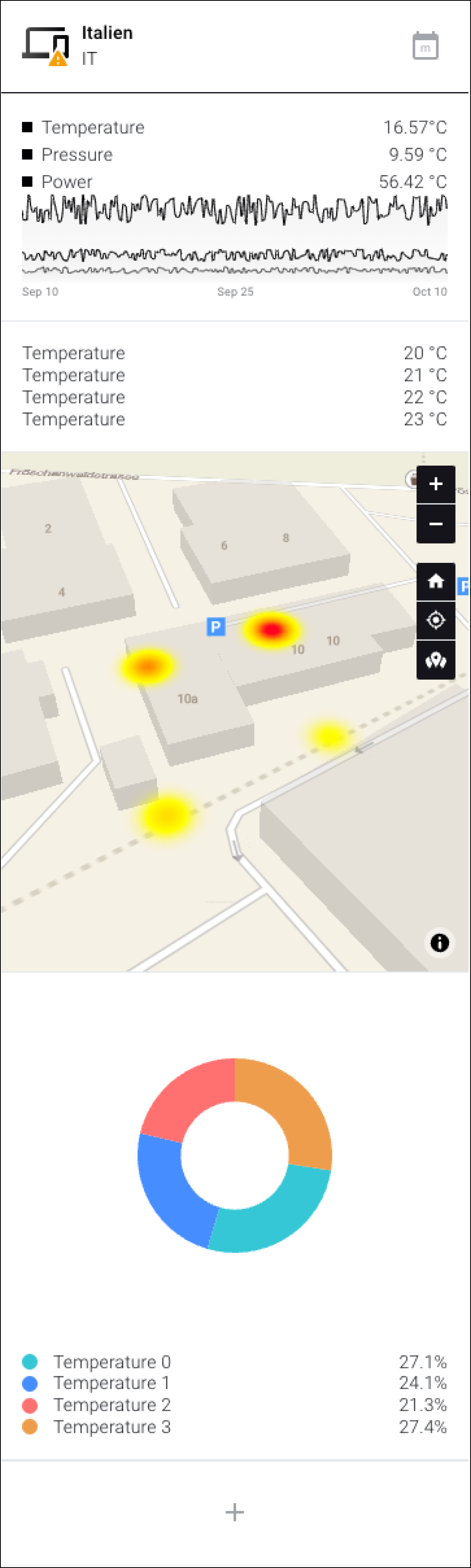
</p></figcaption></figure>

## Step-by-Step: Create a Custom Widget

### Step 1 – Create a Custom Widget

Follow these steps to create an "empty" Custom Widget.

1. Make sure you are in the "Dashboards" menu item
2. In the context bar, click on "Widgets"

   ▷ The widget selection opens
3. Click on Custom Widget
4. Enter a name
5. Select an icon. This icon will later appear in the title bar of the widget
6. Click on "Confirm"

   ▷ The new widget has been created

### Step 2 – Customize the New Widget

After the widget has been created in step 1, you can make the first adjustments.

<div data-full-width="true"><figure><img src="https://3489494878-files.gitbook.io/~/files/v0/b/gitbook-x-prod.appspot.com/o/spaces%2F9GvUpaatBiReR43XFSMg%2Fuploads%2FUMFopMQFtogiCh9UHviY%2FE78E66A2-A811-4513-BC3D-AB642F164C39.png?alt=media&#x26;token=6f3d819f-917c-4d2d-895d-5a5e18c30004" alt=""><figcaption><p>Fig. 2:</p></figcaption></figure></div>

<table data-full-width="true"><thead><tr><th width="62.333333333333314"></th><th width="147.5999755859375"></th><th></th></tr></thead><tbody><tr><td><strong>[A]</strong></td><td>Back/Cancel</td><td>Return to the widget overview, <strong>without</strong> saving.</td></tr><tr><td><strong>[B]</strong></td><td>Name</td><td>You can adjust the name here afterward.</td></tr><tr><td><strong>[C]</strong></td><td>Icon</td><td>You can adjust the icon here afterward.</td></tr><tr><td><strong>[D]</strong></td><td>Save</td><td>Save inputs.</td></tr><tr><td><strong>[E]</strong></td><td>Preview</td><td>A preview of what the created widget will look like.</td></tr><tr><td><strong>[F]</strong></td><td>Add module</td><td>Click here to add modules to the widget.</td></tr><tr><td><strong>[G]</strong></td><td>Set test data</td><td>Click here to set test data.<br>Explained in more detail under -> Set test data</td></tr><tr><td><strong>[H]</strong></td><td>Alarm data</td><td>If this box is checked, the alarms of the asset that was defined under "Primary Asset" will be displayed in the widget.<br><br>The "Primary Asset" is specified when you have finished configuring the Custom Widget and add it to the dashboard. See X</td></tr></tbody></table>

### Step 3 – Add a Module

<div data-full-width="true"><figure><img src="https://3489494878-files.gitbook.io/~/files/v0/b/gitbook-x-prod.appspot.com/o/spaces%2F9GvUpaatBiReR43XFSMg%2Fuploads%2F592OnCGcLf1hxMEy9uRM%2F753B9218-81BD-45FC-9726-F1E771448519.png?alt=media&#x26;token=8cdd535c-0633-43b6-911c-64c8c94a1142" alt=""><figcaption><p>Fig. 3: The module selection</p></figcaption></figure></div>

1. Click on **\[F]** to add the first module to the new widget.

   ▷ The module selection (Fig. 3) appears
2. Move the mouse over a module to display a short description
3. Click on a module to add it to the Custom Widget

   ▷ The **preview \[E]** of the widget is updated with the new module.

   ▷ The **module options \[I]** (Fig. 4) open
4. Configure the module in the **module options \[I]**
5. Click on the **Save** button **\[J]** to save the settings of the module or click on **\[K]** to cancel.

{% hint style="info" %}
A detailed explanation of the configuration options for each module can be found in the chapter [-> Modules](https://docs.buildings.ability.abb/collection/platform/live-cockpit/widgets/custom-widgets/modules)
{% endhint %}

<div data-full-width="true"><figure><img src="https://3489494878-files.gitbook.io/~/files/v0/b/gitbook-x-prod.appspot.com/o/spaces%2F9GvUpaatBiReR43XFSMg%2Fuploads%2Fm0bzqrqkn7BwYpRjjOoE%2F1F4F8BFC-8755-46B8-AB27-92B0C9DC98F7.png?alt=media&#x26;token=c1b09de9-2c7e-42d4-ad75-39bfdf328912" alt=""><figcaption><p>Fig. 4 – Module with module options</p></figcaption></figure></div>

{% hint style="warning" %}
**DO NOT** click on the upper Save button \[D] (see Fig. 1)!

Make sure you click on the button **\[J]** for the respective module. Otherwise, the settings you made for the module will be lost.
{% endhint %}

### Step 4 – Add and Arrange More Modules

1. Click on **\[F]**

   ▷ The module selection (Fig. 3) opens.
2. Click on the module that you want to add to the widget
3. Proceed as explained in step 3 to configure the new module.

## Rearrange Modules

You can arrange modules within the Custom Widget as you like.

1. In the **preview \[E]**, click on a module.

   ▷ The module is bordered in black
2. Click on **\[L]**

   ▷ The module is moved up
3. Click on **\[M]**

   ▷ The module is moved down

## Delete Modules

You can delete a module from the Custom Widget.

1. In the **preview \[E]**, click on a module.

   ▷ The module is bordered in black
2. Click on **\[N]**

   ▷ The module is deleted

## Set Test Data

You can simulate what your new Custom Widget will look like when it has been filled with data.

To do this, use the **Set test data** function **\[G]**

1. Make sure you are in the "Dashboards" menu item
2. In the context bar, click on "Widgets"

   ▷ The widget selection opens
3. Click on the Custom Widget for which you want to set test data
4. Click on **Set test data \[G]**

   ▷ The "Test Data" window appears (Fig. 5)
5. Make the desired settings
6. Click on **Continue \[S]**

   ▷ You will see the simulated data in the **preview \[E]**

{% hint style="info" %}
The simulated data only affects the preview of the Custom Widget.

The simulated data is only for a better overview of what a finished Custom Widget will look like.

The simulated data has no influence on the Custom Widget after it has been created and saved.
{% endhint %}

<figure><img src="https://3489494878-files.gitbook.io/~/files/v0/b/gitbook-x-prod.appspot.com/o/spaces%2F9GvUpaatBiReR43XFSMg%2Fuploads%2FCssn7OxO9bj0mxsyEAg8%2F377B309E-5B70-49A8-8F71-D40BB8A50104.png?alt=media&#x26;token=dae2a066-11d7-460f-8944-f3109de060ab" alt=""><figcaption><p>Fig. 5 – "Test Data" window</p></figcaption></figure>

<table data-full-width="true"><thead><tr><th width="58.133321126302064"></th><th width="116"></th><th></th></tr></thead><tbody><tr><td><strong>[O]</strong></td><td>Asset</td><td>Simulates the display of the title of the Primary Asset in the <strong>Title bar [T]</strong> (Fig. 6)</td></tr><tr><td><strong>[P]</strong></td><td>Alarm</td><td><p>Simulates the alarm level in the <strong>Widget icon [U]</strong> or the <strong>Title bar [T]</strong> (Fig. 6)<br><br>Available values:</p><ul><li>0: No alarm</li><li>1: High alarm level / Title bar [T] turns red</li><li>2: Medium alarm level / Yellow symbol in the widget icon [U]</li><li>3: Low alarm level / Green symbol in the widget icon [U]</li></ul></td></tr><tr><td><strong>[Q]</strong></td><td>Time span</td><td>Only effective for certain modules, e.g. Trends.<br><br>Changes the scaling of trends, the same effect is caused when <strong>[V]</strong> is pressed.</td></tr><tr><td><strong>[R]</strong></td><td>Number of assets</td><td>Only effective for certain modules, e.g. Donuts.<br><br>Simulates how the module changes when more assets are linked to it</td></tr><tr><td><strong>[S]</strong></td><td>Continue</td><td>Apply inputs and close the "Test Data" window</td></tr></tbody></table>

<figure><img src="https://3489494878-files.gitbook.io/~/files/v0/b/gitbook-x-prod.appspot.com/o/spaces%2F9GvUpaatBiReR43XFSMg%2Fuploads%2FErWQWGWZsguFkcZsSIB0%2FC6D0EF1E-4479-4472-A939-0FDE8C55E138.png?alt=media&#x26;token=d876f348-b30a-487e-978e-c13da8e02068" alt=""><figcaption><p>Fig. 6</p></figcaption></figure>


---

# Agent Instructions: Querying This Documentation

If you need additional information that is not directly available in this page, you can query the documentation dynamically by asking a question.

Perform an HTTP GET request on the current page URL with the `ask` query parameter:

```
GET https://docs.buildings.ability.abb/collection/platform/live-cockpit/widgets/custom-widgets.md?ask=<question>
```

The question should be specific, self-contained, and written in natural language.
The response will contain a direct answer to the question and relevant excerpts and sources from the documentation.

Use this mechanism when the answer is not explicitly present in the current page, you need clarification or additional context, or you want to retrieve related documentation sections.
