> For the complete documentation index, see [llms.txt](https://docs.buildings.ability.abb/collection/llms.txt). Markdown versions of documentation pages are available by appending `.md` to page URLs; this page is available as [Markdown](https://docs.buildings.ability.abb/collection/platform/live-cockpit/widgets/custom-widgets/modules/inputs-and-switches.md).

# Inputs & Switches

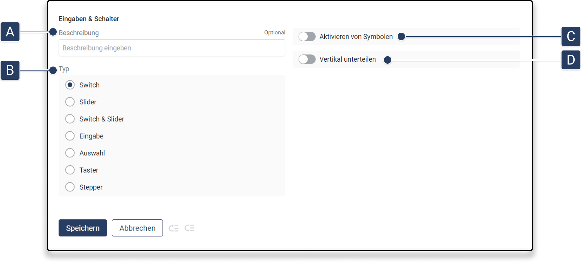
The "Inputs & Switches" module allows you to display a wide variety of switches, sliders, and fields for entering values in a widget.

<figure><img src="https://3489494878-files.gitbook.io/~/files/v0/b/gitbook-x-prod.appspot.com/o/spaces%2F9GvUpaatBiReR43XFSMg%2Fuploads%2FslwKob34386F46oKryhn%2FInput.png?alt=media&#x26;token=0e02a340-0fbb-4857-9f3d-66aa06c7205a" alt=""><figcaption></figcaption></figure>

<table data-full-width="true"><thead><tr><th width="62.93333943684894"></th><th width="144.59991455078125"></th><th></th></tr></thead><tbody><tr><td><strong>[A]</strong></td><td>Description</td><td>This text is displayed when the custom widget is later connected to assets</td></tr><tr><td><strong>[B]</strong></td><td>Type</td><td><ul><li><strong>Switch:</strong> The switch allows an asset to be toggled between two values</li><li><strong>Slider:</strong> A value can be selected within a value range via a slider.</li><li><strong>Vertical Slider</strong>: Like "Slider", but the slider is arranged vertically.</li><li><strong>Switch and Slider</strong>: Combination of "Slider" and "Switch"</li><li><strong>Input:</strong> A value can be entered.</li><li><strong>Selection:</strong> A value can be selected from multiple values for each asset via a drop-down menu.</li><li><strong>Button</strong>: You can set values via a button</li><li><strong>Stepper:</strong> The stepper allows for the gradual adjustment of a value via increment and decrement buttons. The step size can be configured in the <em>Asset Template</em>. <a href="/pages/eVD0XKpFPnH3h7UusNji">-> Thresholds in the Asset Template</a></li></ul></td></tr><tr><td><strong>[C]</strong></td><td>Activate symbols</td><td>When activated, the symbols of the corresponding attributes are displayed.</td></tr><tr><td><strong>[D]</strong></td><td>Divide vertically</td><td>When activated, the inputs are no longer displayed one below the other, but also next to each other.</td></tr></tbody></table>


---

# Agent Instructions
This documentation is published with GitBook. GitBook is the documentation platform designed so that both humans and AI agents can read, navigate, and reason over technical content effectively. Learn more at gitbook.com.

## Querying This Documentation
If you need additional information that is not directly available in this page, you can query the documentation dynamically by asking a question.

Perform an HTTP GET request on the current page URL with the `ask` query parameter, and the optional `goal` query parameter:

```
GET https://docs.buildings.ability.abb/collection/platform/live-cockpit/widgets/custom-widgets/modules/inputs-and-switches.md?ask=<question>&goal=<endgoal>
```

`ask` is the immediate question: it should be specific, self-contained, and written in natural language.
`goal` is optional and describes the broader end goal you are ultimately trying to accomplish on behalf of the user. GitBook uses it to tailor the answer towards what is most useful for that goal.

The response will contain a direct answer to the question and relevant excerpts and sources from the documentation.

Use this mechanism when the answer is not explicitly present in the current page, you need clarification or additional context, or you want to retrieve related documentation sections.