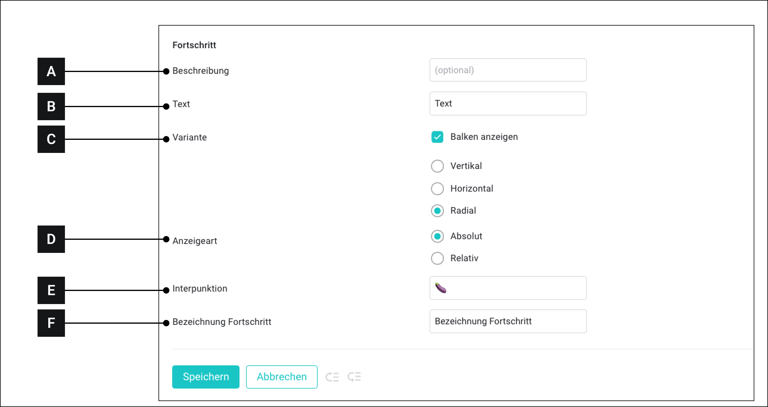
# Progress

The "Progress" module offers various display types for progress or fill levels.

<figure><img src="https://3489494878-files.gitbook.io/~/files/v0/b/gitbook-x-prod.appspot.com/o/spaces%2F9GvUpaatBiReR43XFSMg%2Fuploads%2FJJO6rdMbo8xaXiUlG0wR%2FB70E73B3-7AF4-4BD3-B6F4-E0CE733731CB.png?alt=media&#x26;token=79c0b3d5-051b-4a5c-9fbb-4380cd8d08fe" alt=""><figcaption></figcaption></figure>

<table data-full-width="true"><thead><tr><th width="62.79998779296875"></th><th width="147.4000244140625"></th><th></th></tr></thead><tbody><tr><td><strong>[A]</strong></td><td>Description</td><td>This text is displayed when the custom widget is later connected to assets</td></tr><tr><td><strong>[B]</strong></td><td>Text</td><td>Free text</td></tr><tr><td><strong>[C]</strong></td><td>Variant</td><td><ul><li><strong>Show bars:</strong> If this option is enabled, a chart is displayed above the values.<br>If this option is NOT enabled, only the values are displayed.</li><li><strong>Vertical:</strong> Displays a vertical bar</li><li><strong>Horizontal:</strong> Displays a horizontal bar</li><li><strong>Radial:</strong> Displays a curved vertical bar</li></ul></td></tr><tr><td><strong>[D]</strong></td><td>Display type</td><td><ul><li><strong>Absolute:</strong> Displays the progress as absolute values.</li><li><strong>Relative:</strong> Displays the progress in percent</li></ul></td></tr><tr><td><strong>[E]</strong></td><td>Punctuation</td><td>Is only available when "Absolute" is selected as the display type. Here you can enter the symbol that stands between the two values</td></tr><tr><td><strong>[F]</strong></td><td>Progress label</td><td>This text is below the values between the percentage.</td></tr></tbody></table>
