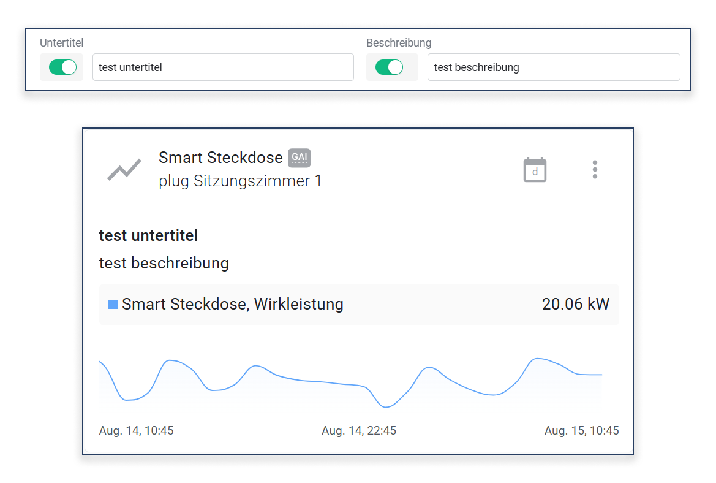
# Operating Widgets

## Widget Options

You can open additional options for each widget.

Click the button **\[A]** on any widget to show more options.

<div data-full-width="true"><figure><img src="https://3489494878-files.gitbook.io/~/files/v0/b/gitbook-x-prod.appspot.com/o/spaces%2F9GvUpaatBiReR43XFSMg%2Fuploads%2FldGR52KHVBjXa1ULfdeq%2F1F25F736-D196-4AAB-8429-E9C914F8B8E6.png?alt=media&#x26;token=7aa944ce-1e1e-4083-8ce5-0aeb20555eb4" alt=""><figcaption><p>The "Show Widget Options" button. Works for all available widgets.<br>Shown here as an example on a widget for analog trends.</p></figcaption></figure></div>

<div data-full-width="true"><figure><img src="https://3489494878-files.gitbook.io/~/files/v0/b/gitbook-x-prod.appspot.com/o/spaces%2F9GvUpaatBiReR43XFSMg%2Fuploads%2FZhTWHP8gfgXshMmRfZ3V%2F0E205E95-B722-4347-A19F-15EA91266DAD.png?alt=media&#x26;token=f9855c5d-a6ee-43d4-9b8e-0cfafd42e8d2" alt=""><figcaption><p>The widget options</p></figcaption></figure></div>

<table data-full-width="true"><thead><tr><th width="84.33333333333331"></th><th width="147.39996337890625"></th><th></th></tr></thead><tbody><tr><td><strong>[B]</strong></td><td>Go to...</td><td>Calls up available points related to the widget. See <a href="operating-widgets">-> Navigate via widgets</a> for more details</td></tr><tr><td><strong>[C]</strong></td><td>Edit</td><td>You can make changes to the content of the widget via this item.</td></tr><tr><td><strong>[D]</strong></td><td>Create analytic</td><td>Creates an analytic for the selected widget</td></tr><tr><td><strong>[E]</strong></td><td>Change size</td><td>Changes the size of the widget</td></tr><tr><td><strong>[F]</strong></td><td>Remove</td><td>Removes the widget from the dashboard.<br>⚠ This action cannot be undone!</td></tr></tbody></table>

## Arrange Widgets

See [↗ Organize Dashboards](https://docs.buildings.ability.abb/collection/platform/live-cockpit/organize-dashboards).

## Navigate via Widgets

<figure><img src="https://3489494878-files.gitbook.io/~/files/v0/b/gitbook-x-prod.appspot.com/o/spaces%2F9GvUpaatBiReR43XFSMg%2Fuploads%2FoWTVpH0f7gL2lHdn1Xei%2FDocs_Widgets%20-%20U%CC%88ber%20Widgets%20navigieren.png?alt=media&#x26;token=176d59ef-e8a7-4b92-a635-5896ef7f77b1" alt=""><figcaption></figcaption></figure>

The "Go to..." option allows you to navigate directly from the widget to relevant settings.

<table data-full-width="true"><thead><tr><th width="82.33333333333331">Symbol</th><th width="218.800048828125">Description</th><th>Details</th></tr></thead><tbody><tr><td><strong>A</strong></td><td>Alarm</td><td>Call up <a href="../../alert-center/alarms">-> Alarms</a> of the primary asset</td></tr><tr><td><strong>B</strong></td><td>Ticket</td><td>Call up <a href="../../service-desk">-> Tickets</a> of the primary asset</td></tr><tr><td><strong>C</strong></td><td>Rules</td><td>Call up <a href="../../alarms-rules-and-escalations/rules">-> Rules</a> of the primary asset</td></tr><tr><td><strong>D</strong></td><td>Asset</td><td>Call up <a href="../../../mandatory-base/assets">-> Asset</a> details of the primary asset</td></tr><tr><td><strong>E</strong></td><td>Data</td><td>Call up <a href="../../../mandatory-base/assets/asset-data">-> Data</a> of the primary asset</td></tr><tr><td><strong>F</strong></td><td>Analytics and Reports</td><td>Call up <a href="broken-reference">-> Analytics</a> and Reports of the primary asset</td></tr><tr><td><strong>G</strong></td><td>Map</td><td>Call up <a href="../../map-and-floor/map">-> Map</a> of the primary asset</td></tr><tr><td><strong>H</strong></td><td>BIM</td><td>Call up <a href="../../bim">-> BIM</a> of the primary asset</td></tr><tr><td><strong>I</strong></td><td>Digital Twin</td><td>Call up the <a href="../../photoreal-twin">-> Digital Twin</a> of the primary asset</td></tr></tbody></table>

{% hint style="info" %}
It always navigates to the primary asset that has been set for the respective widget.
{% endhint %}

## Add Subtitle and Description

For each widget, you can now additionally define a **subtitle** and a **description**. These fields offer the possibility to provide the widget with further information or context—directly visible in the widget itself.

<figure><img src="https://3489494878-files.gitbook.io/~/files/v0/b/gitbook-x-prod.appspot.com/o/spaces%2F9GvUpaatBiReR43XFSMg%2Fuploads%2Fw6Fqxqt00hmDYH7wbAwx%2FWidget%20Untertitel%20Beschreibung.png?alt=media&#x26;token=2c2bb232-dfea-4ccb-8412-0148d29b6ae0" alt=""><figcaption></figcaption></figure>

* **Subtitle**: A short, highlighted text below the widget title. Ideal for additional information such as location, device type, or status.
* **Description**: A free text field for a more detailed explanation of the widget's content, e.g., purpose, measurement range, or special notes.
